ShopDreamUp AI ArtDreamUp

Deviation Actions
Comic Tier
2 Subscribers
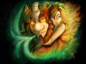
Burnt out folklorist hides from the world and her antagonist who plumber the outside of her home. Upon receiving a random invite to a cabin from a fan. Mel escapes the drudgery of her life only to find another annoying neighbor who turns out to be fey. Can she survive the encounter or can Mel give him an offer he can't refuse?
This tier has all of Shurale season 1 and 2 Shurale fairytales! Updated every month.
$5/month


Suggested Deviants


Suggested Collections
![DAI - But not in this world 2 [SPOILERS]](https://images-wixmp-ed30a86b8c4ca887773594c2.wixmp.com/f/3d8b6533-e2fb-418f-9794-027364ded478/d8fcaru-b1a5e0b7-d35d-4b53-b0e8-8e702b70fb6c.jpg/v1/crop/w_184,h_184,x_0,y_456,scl_0.16727272727273,q_70,strp/dai___but_not_in_this_world_2__spoilers__by_k_yon_d8fcaru-92s-2x.jpg?token=eyJ0eXAiOiJKV1QiLCJhbGciOiJIUzI1NiJ9.eyJzdWIiOiJ1cm46YXBwOjdlMGQxODg5ODIyNjQzNzNhNWYwZDQxNWVhMGQyNmUwIiwiaXNzIjoidXJuOmFwcDo3ZTBkMTg4OTgyMjY0MzczYTVmMGQ0MTVlYTBkMjZlMCIsIm9iaiI6W1t7ImhlaWdodCI6Ijw9MTExNzEiLCJwYXRoIjoiXC9mXC8zZDhiNjUzMy1lMmZiLTQxOGYtOTc5NC0wMjczNjRkZWQ0NzhcL2Q4ZmNhcnUtYjFhNWUwYjctZDM1ZC00YjUzLWIwZTgtOGU3MDJiNzBmYjZjLmpwZyIsIndpZHRoIjoiPD0xMDI0In1dXSwiYXVkIjpbInVybjpzZXJ2aWNlOmltYWdlLm9wZXJhdGlvbnMiXX0.9jNiaPYCDIhs0O32ERDWuwVXod9Ofxr2O5-V0ro2PDs)
![DAI - But not in this world 2 [SPOILERS]](https://images-wixmp-ed30a86b8c4ca887773594c2.wixmp.com/f/3d8b6533-e2fb-418f-9794-027364ded478/d8fcaru-b1a5e0b7-d35d-4b53-b0e8-8e702b70fb6c.jpg/v1/crop/w_92,h_92,x_0,y_228,scl_0.083636363636364,q_70,strp/dai___but_not_in_this_world_2__spoilers__by_k_yon_d8fcaru-92s.jpg?token=eyJ0eXAiOiJKV1QiLCJhbGciOiJIUzI1NiJ9.eyJzdWIiOiJ1cm46YXBwOjdlMGQxODg5ODIyNjQzNzNhNWYwZDQxNWVhMGQyNmUwIiwiaXNzIjoidXJuOmFwcDo3ZTBkMTg4OTgyMjY0MzczYTVmMGQ0MTVlYTBkMjZlMCIsIm9iaiI6W1t7ImhlaWdodCI6Ijw9MTExNzEiLCJwYXRoIjoiXC9mXC8zZDhiNjUzMy1lMmZiLTQxOGYtOTc5NC0wMjczNjRkZWQ0NzhcL2Q4ZmNhcnUtYjFhNWUwYjctZDM1ZC00YjUzLWIwZTgtOGU3MDJiNzBmYjZjLmpwZyIsIndpZHRoIjoiPD0xMDI0In1dXSwiYXVkIjpbInVybjpzZXJ2aWNlOmltYWdlLm9wZXJhdGlvbnMiXX0.9jNiaPYCDIhs0O32ERDWuwVXod9Ofxr2O5-V0ro2PDs)


You Might Like…


Featured in Groups


Description
previous -> prologue 3_1 next -> prologue 3_3
new strip, new colours
so... the good news is... prologue 3 part 2 is ready.
the bad news is... I like this way of colouring way better, but it's also a lot more time consuming
which means that It will probably tame more time to complete every strip -_-
by the way, I feel like I'm improving my drawing and my colouring, and I even like more the framing... I hope you feel the same")
new strip, new colours
so... the good news is... prologue 3 part 2 is ready.
the bad news is... I like this way of colouring way better, but it's also a lot more time consuming
which means that It will probably tame more time to complete every strip -_-
by the way, I feel like I'm improving my drawing and my colouring, and I even like more the framing... I hope you feel the same
Image size
1000x7500px 1.39 MB
Comments11
Join the community to add your comment. Already a deviant? Log In
I liked reading trough your prologue comics a lot. The concept of having 3 different point of views telling the same events so we can discover new details and angles work really well, and the pay-off (the -almost literal- cliffhanger at the end) is spot on as well.
I've a few thoughts about the art style, it's clear that the latest strip of the 4 looks the best, and in my opinion the 3rd strip stands out the most. I really don't like that texture that you've placed over the whole page of 3 part 1. It's muddy and messy and I think it would look better without it.
It's always good to experiment with new styles of course. But if you want this to be part of a bigger story- meaning that people might revisit the older pages - I would remove the texture from that part of the comic.
As for your storytelling, the thing that will improve your comic most is to pay more attention to the reading direction when drawing.
You did a good job at paneling (it's getting better with each page), and the speech bubble placement wasn't bad at all (though the balloons and the font might be a bit large).
Most of the action/acting was easy to follow and understand (especially in the last 2 strips), the only exception being: the kid bumping into the Orc, pickpocketing him, in the first two pages. I could understand what was going on from the context, but just barely.
The direction of the action within your panels however, often conflicted with the reading direction. There's a whole bunch of panels I'd simply flip, so it would read better: In prologue
2 I'd flip panels 2 3 and 4 and the panels of him running. In 3 part 2 I would flip panel 2 and all the shots where she reaches the water and jumps in and climbs out again.
Some small notes:
- I noticed that the che characters often speak without opening their mouths. It's ok if this happens once of twice (especially in big panels which are intended to show a longer moment in time), but try to keep it to a minimum.
- I loved the guy who's picking his nose XD.
- don't use WTF, unless it's a style choice where you have your characters talk in internet slang. It really pulled me out of the story for a moment.
You can tell, by comparing the first and the last, that you're storytelling has improved quite a bit already in those 4 strips. I think you are on the right track, and if you keep improving at this rate you'll be creating the most amazing comics in no time <img src="e.deviantart.net/emoticons/b/b…" width="15" height="15" alt="